Taking A Look Back At The Past 10 Years
Last week we looked at the ENR 500 and tried to pull out whatever interesting information we could find. This week we turn back to the ENR 500 and take a bit of a deeper dive. We aren’t taking the drawn out, step-by-step approach we did last time. Instead we’ll present some information and add our own insights where appropriate.

It has been about a week since the first post. We hope to maintain that kind of frequency. We will post whenever we have new or interesting information. Our goal with this blog is to aim for quality while providing some kind of regularity. We also want to give enough time to digest what may be “longer than average” blog posts.
In order to look at how the ENR 500 has changed over time, we took the last ten years of data and carved it up to see what might be of interest. What does it look like if we divide the firms into various “income” brackets based on their domestic (US) revenue? Here is that data in table form.
ENR Top 500 Revenue Distribution
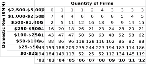
“What the heck am I looking at?” If we look in the top left corner we see that one firm earned between $2.5 and $5 billion dollars in 2002. Each value in the table is the number of firms that occupy that “income bracket”. Feel free to draw your own conclusions from these values. Tables are generally worse than graphs at showing changes in time so let’s graph it.
ENR Top 500 Revenue Distribution
This is hopefully a little more interesting. Perhaps a bit dated but we see a very clear (albeit delayed) indication of the recession. Just prior to the economy’s change, most ENR 500 firms were earning over $25MM (again, domestic revenue only). Leading up to the recession we see an expansion in both the $25-$50MM and $50-$100MM segments. This suggests that many firms crossed the $50MM threshold in the years following 2003. That trend started reversing in 2007 and didn’t actually bottom out until 2011. Perhaps more relevant and provocative is the apparent repeat of that shift in more recent years. Firms in the sub-$25MM range are decreasing and the number of $25-$50MM firms appears to be increasing.
This is good news for Consultants and Engineers that want to work for these companies. Perhaps a slight cause for concern however is the apparent lack of growth in the $50-$100MM and $100-$250MM segments. It is difficult to prove exactly what is causing this. We can however look into the possibility that the large companies at the top of the list are reducing the pool of revenue for everyone else. This graph is not the best way to answer that, so we should shift our focus away from the number of firms and more towards the combined revenue of these segments.
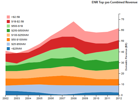
ENR Top 500 Combined Revenue
 How did we get this graph? We started by taking the revenue from firms that earned less than $25MM, and added them up. Then we took the revenue from firms that made between $25MM and $50MM and added them up. We’re still using the “income bracket” analogy. This time however we combined the revenue for each of the companies in those brackets, instead of just adding the number of companies.
Why is this useful? It gives us one way of seeing where money goes, it also let’s us answer the question about big firms crowding out smaller firms. Prior to 2006, the $2.5B+ segment made up a fairly small percentage of the overall revenue earned by these firms (just under 6%). There was only one firm who even entered this category so not really all that “powerful”. Since then that segment has grown both in revenue and in number of firms. In 2012 there were 3 companies who occupied this segment taking up 17.6% of the market. Certainly an improvement over their position 10 years ago.
 Is this a bad thing? It is and it isn’t depending on where you’re sitting. It’s bad if you’re sitting at an A/E/C firm and you’re trying to compete at the top of the market. Higher revenues and more competition means higher risk. It’s also tough for companies sitting near the edge of this top-tier because it’s hard to overcome the momentum of those giants.
The flip side of this coin is the revenue stability in the smaller segments. I refer to it as being “stable” because we don’t see any major expansions or contractions between $25MM and $500MM. This suggests a fairly dependable revenue stream for a certain segment of the market. If this were not the case we might see the lower revenue segments shrinking as they got “crowded out” by the larger firms. According to this data, the market has actually grown to accommodate the new giants and left the other players relatively unaffected (of course, this excludes firms outside the ENR 500).
You may be thinking about this dataset and wondering if we can get a look at what happened with each individual company. We certainly have the data for it. When we tried to graph the individual companies we got a warning in Excel that “you can only graph 255 entries”. Even after pulling out 623 “non-architectural” and data limited companies (firms that had less than 7 years of data) we knew it would still be painful on the eyes. Instead we opted for the interactive visualization below. The graph shows the annual revenue for 200 firms practicing architecture that also participated in the ENR 500 for 7 years or more). We included some regional filters. It’s interesting to get a rough sense of how income is distributed regionally. It may be of interest to note that even though our dataset is limited to 500 companies annually, over a 10 year span we have actually captured data for 845 unique companies (after adjusting for mergers and name changes)
Lastly please note that this is plotted on a log scale to minimize the differences between market segments.